
Hugo - Page Bundle shortcodes for images

In this post I describe how to declare images of the page bundle in the front matter of the Markdown file. Since the Markdown possibilities of the image output are not sufficient for me, I have programmed two shortcodes with more possibilities ( size, positioning, caption).
The source code of the shortcodes described below can of course be optimized. You could also combine the shortcodes in one shortcode. But then the structure and the passing to such a shortcode becomes more complex. I do not catch possible wrong passing parameters. For my purposes the structure as described is sufficient.
In the Hugo documentation - Page Bundles - and - Page Resources - you can read detailed information about the topics described here.
Page Bundle Structure
The structure for my page bundles looks like this:
content/
  ├── blog/
        ├── name-of-page-bundle1/
              ├── img/
                  └── image-name1.jpg
                  └── image-name2.jpg
              ├── index.en.md
              └── index.md
        ├── name-of-page-bundle2/
        ├── name-of-page-bundle3/
        ├── _index.en.md
        └── _index.md
  ├── about-me/
        ├── img/
            └── image-name1.jpg
        ├── index.en.md
        └── index.md
..
For each web page, a page bundle is created in the content directory. Each page bundle consists of the directory name of the page bundle, a markdown file index.md for the main language and a subdirectory img for the image files. I stored my blog posts in the content/blog/ directory. Over time, with more and more blog posts, this makes it more manageable for me.
I store the Page Bundles of the general web pages - About Me, Data Protection, Legal Notice and the Contact page directly in the content directory.
The page bundle directory name can also be changed later. This has no influence on the URL structure. The directory name is only used for the own organization of the page bundles.
By the structure all files for a web page are stored within a directory. Of course, other file types, for example PDF, can be stored there as well.
Front Matter details of the image files
---

title: "Title web page"
..
resources:
- name: image-name1
  src: img/image1.jpg
- name: image-name2
  src: img/image2.jpg

---
Below the normal Front Matter identifiers, the resources: section is created. The description of each resource starts with a hyphen followed by a space. After that, the name of the resource is specified. This name will be passed to the shortcodes later.
The next line specifies the path to the resource file depending on the page bundle directory. So in my case img/image1.jpg. The Front Matter identifier for this is src: followed by a space and the path. Indenting from the resource identifier is not only visually clearer, but is expected by Hugo with a tab (tabulator). Otherwise there is a generation error.
You can specify as many resources as you need for this web page.
Shortcode img100width.html
This shortcode displays an image with the width of 100%. The width is limited in my theme by the width of the content area, which I limit. If your theme does not limit the content width, the image will probably look oversized.
Within the Markdown file, the shortcode is called as follows:
{{< img100width "resource-name" "alt attribute content" "Caption text to be displayed below the image." >}}
The shortcode name (without .html) is specified first. Parameter 1 is the resource name, parameter 2 is the content for the alt attribute, parameter 3 is the caption text that is displayed below the image.
The source code in the path layouts/shortcodes/img100width.html looks like this:
{{ $img := $.Page.Resources.GetMatch (.Get 0) }}
{{ $imgalt := (.Get 1) }}
{{ $imgcaption := (.Get 2) }}
{{ with $img }}
  {{ with $imgcaption }}
  <figure class="box-100">
    <img src="{{- $img.RelPermalink -}}" class="img100width" loading="lazy" alt="{{- $imgalt -}}">
    <div class="img100caption">
      <figcaption>
        <svg xmlns="http://www.w3.org/2000/svg" width="16" height="16" fill="currentColor" class="bi bi-camera" viewBox="0 0 16 16">
          <path d="M15 12a1 1 0 0 1-1 1H2a1 1 0 0 1-1-1V6a1 1 0 0 1 1-1h1.172a3 3 0 0 0 2.12-.879l.83-.828A1 1 0 0 1 6.827 3h2.344a1 1 0 0 1 .707.293l.828.828A3 3 0 0 0 12.828 5H14a1 1 0 0 1 1 1v6zM2 4a2 2 0 0 0-2 2v6a2 2 0 0 0 2 2h12a2 2 0 0 0 2-2V6a2 2 0 0 0-2-2h-1.172a2 2 0 0 1-1.414-.586l-.828-.828A2 2 0 0 0 9.172 2H6.828a2 2 0 0 0-1.414.586l-.828.828A2 2 0 0 1 3.172 4H2z"/>
          <path d="M8 11a2.5 2.5 0 1 1 0-5 2.5 2.5 0 0 1 0 5zm0 1a3.5 3.5 0 1 0 0-7 3.5 3.5 0 0 0 0 7zM3 6.5a.5.5 0 1 1-1 0 .5.5 0 0 1 1 0z"/>
        </svg>
        {{- $imgcaption -}}
      </figcaption>
    </div>
  </figure>
  {{ else }}
  <img src="{{- $img.RelPermalink -}}" class="img-box100width" alt="{{- $imgalt -}}">
  {{ end }}
{{ end }}
From the shortcode point of view, the resource name parameter 1 described above becomes the parameter 0. With {{ $img := $.Page.Resources.GetMatch (.Get 0) }} the resource identifier src: is accessed via the resource name and the path is stored in the variable $img.
If a caption for the image was passed {{ with $imgcaption }} the HTML tag figure is filled, otherwise only the HTML tag img is output. To ensure that no caption is output, the parameter must be passed empty. This means "".
The rest is web design. The HTML tag figure is assigned the CSS class box-100. The img with caption the CSS class img100width, without caption img-box100width. The figcaption is integrated into a div with the CSS class img100caption. This allows this part to be better designed.
In the figcaption, a camera icon is displayed as SVG before the caption text. How to get the cryptic, alphanumeric SVG details and use it in Hugo I have described in my blog post - Free Bootstrap SVG icons in Hugo use
- described. In the blog post, I described several calling methods - unfortunately, sometimes you have no choice. For the figcaption in the img100width.html shortcode, copying “Copy HTML “ via the - clipboard
- off.
SCSS for shortcode img100width.html
// Shortcode img100width
// Image with caption
.box-100 {
  margin: 2.0rem 0;
  border: 1px solid lightgrey;

  .img100width {
    width: 100%;
  }
  .img100caption {
    padding: 0.7rem;
    font-size: 0.8rem;
    border-top: 1px solid lightgrey;
    color: var(--wk-color-2);
    background-color: ghostwhite;
  }
}
// Image without caption
.img-box100width {
  width: 100%;
  margin: 2.0rem 0;
  border: 1px solid lightgrey;
}
// Responsive
@media (max-width: 575.8px) {
  .img100caption {
    display: none;
  }
}
// End - Shortcode img100width
The SCSS code is actually self-explanatory. However, there are two peculiarities.
In the CSS class .img100caption I assign color: the value of a variable var(–wk-color-2);. The content of the variable is #222222. The reason for assigning by variable is the darkmode of my theme. By default, the theme starts in lightmode. A Theme Switcher icon - at the very top, second from the right - can be used to switch to darkmode. At the time of developing this function, I didn’t know yet that I will use the same color for both variants. The variable is therefore superfluous at this point.
For screen widths up to 575.8px, the caption is turned off with display: none;. The ratio of the caption to the image then simply no longer fits.
Example of shortcode img100width.html
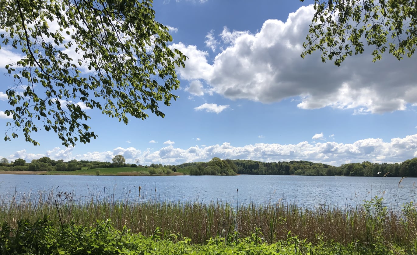
{{< img100width "segeberger-sea" "Segeberger Sea" "Displaying an image with the shortcode img100width.html" >}}
Shortcode imgRight.html
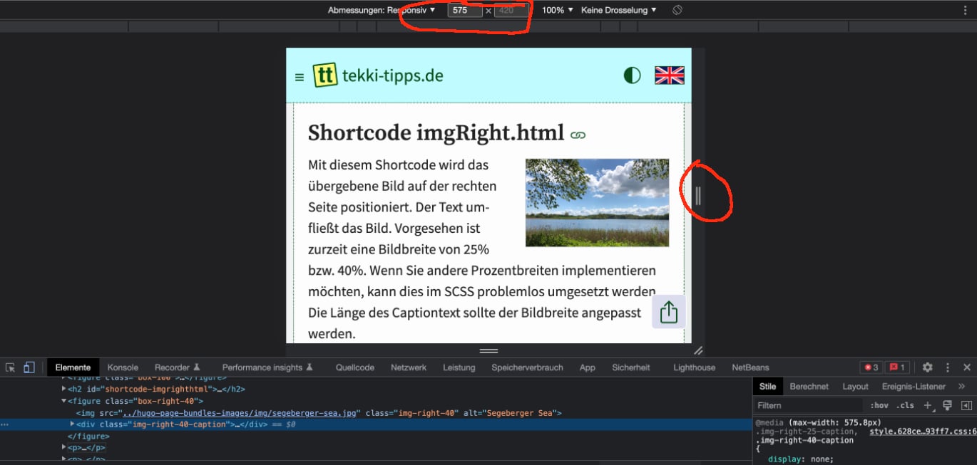
This shortcode positions the passed image on the right side. The text flows around the image. Currently, an image width of 25% or 40% is provided. If you want to implement other percentage widths, this can be easily implemented in SCSS. The length of the caption text should be adapted to the image width.
The call to the shortcode in the markup looks like this: {{< imgRight "segeberger-sea" "40" "Segeberger Sea" "40% image with imgRight.html" >}}
The %-size is passed as parameter 2, all other parameters move to the end as a result. The source code in the path layouts/shortcodes/imgRight.html looks like this:
{{ $img := $.Page.Resources.GetMatch (.Get 0) }}
{{ $imgproz := (.Get 1) }}
{{ $imgalt := (.Get 2) }}
{{ $imgcaption := (.Get 3) }}
{{ with $img }}
  {{ with $imgcaption }}
  <figure class="box-right-{{ $imgproz }}">
    <img src="{{- $img.RelPermalink -}}" class="img-right-{{ $imgproz }}" loading="lazy" alt="{{- $imgalt -}}">
    <div class="img-right-{{ $imgproz }}-caption">
      <figcaption>
        <svg xmlns="http://www.w3.org/2000/svg" width="16" height="16" fill="currentColor" class="bi bi-camera" viewBox="0 0 16 16">
        <path d="M15 12a1 1 0 0 1-1 1H2a1 1 0 0 1-1-1V6a1 1 0 0 1 1-1h1.172a3 3 0 0 0 2.12-.879l.83-.828A1 1 0 0 1 6.827 3h2.344a1 1 0 0 1 .707.293l.828.828A3 3 0 0 0 12.828 5H14a1 1 0 0 1 1 1v6zM2 4a2 2 0 0 0-2 2v6a2 2 0 0 0 2 2h12a2 2 0 0 0 2-2V6a2 2 0 0 0-2-2h-1.172a2 2 0 0 1-1.414-.586l-.828-.828A2 2 0 0 0 9.172 2H6.828a2 2 0 0 0-1.414.586l-.828.828A2 2 0 0 1 3.172 4H2z"/>
        <path d="M8 11a2.5 2.5 0 1 1 0-5 2.5 2.5 0 0 1 0 5zm0 1a3.5 3.5 0 1 0 0-7 3.5 3.5 0 0 0 0 7zM3 6.5a.5.5 0 1 1-1 0 .5.5 0 0 1 1 0z"/>
        </svg>
        {{- $imgcaption -}}
      </figcaption>
    </div>
  </figure>
  {{ else }}
    <img src="{{- $img.RelPermalink -}}" class="image-right-{{ $imgproz }}" alt="{{- $imgalt -}}">
  {{ end }}
{{ end }}
The source code is identical to the previous shortcode except for the % width. The difference lies in the assignment of the CSS class names. These are supplemented by the %-width.
SCSS for shortcode imgRight.html
// Shortcode imgRight -----
.box-right-25,
.box-right-40 {
  display: block;
  float: right;
  margin: 0.3rem 0 0 1.6rem;
  border: 1px solid lightgrey;

  img {
    width: 100%;
  }
  .img-right-25-caption,
  .img-right-40-caption {
    padding: 0.7rem;
    font-size: 0.8rem;
    border-top: 1px solid lightgrey;
    color: var(--wk-color-2);
    background-color: ghostwhite;
  }
}
.box-right-25 {
  width: 25%;
}
.box-right-40 {
  width: 40%;
}
// Responsive
@media (max-width: 575.8px) {
  .img-right-25-caption,
  .img-right-40-caption {
    display: none;
  }
}
@media (max-width: 375.8px) {
  .box-right-25,
  .box-right-40 {
    float: unset;
    width: 100%;
    margin: 1.0rem 0 1.0rem;
  }
}
// End - Shortcode imgRight -----
Different from the SCSS code of the other shortcode is the float: right; statement. With which the image is positioned on the right side.
The CSS class names for 25% and 40% are self-explanatory. Some statements are merged. Again, the caption is turned off up to a screen width of 575.8px. For screens with a maximum width of 375.8px, the image will be displayed with a width of 100%.
Check responsive viewport
So that you can check such responsive screen widths every browser provides corresponding developer tools. With Google Chrome, you can access them via the menu items View | Developer | Developer Tools or by right-clicking the context selector and clicking “Inspect”. You can change the width of the window with the web page on the right side.
Conclusion
Using the shortcodes described above, you should be able to quickly and easily achieve appealing results within your Markdown text. Page Bundles bundle all files into one web page without duplicate structures.
Link list to this post
This might also interest you
- Use free Bootstrap SVG Icons in Hugo
Integrate SVG icons with HTML and CSS/SCSS in Hugo
With the German language setting, comments are not displayed in the English version of the website and vice versa.